The logo is the brand identification of the Pacific Union Conference as well as the Seventh-day Adventist Church. It’s important that it be used consistently and without alteration of any kind. The following pages contain information about how the logo is to be used properly.

The Mark, Signature, and Tagline
What is commonly referred to as the “logo” is a combination of two or more elements—the mark, which is the graphic symbol, the signature which is the name of the organization, and in some cases, the tagline.
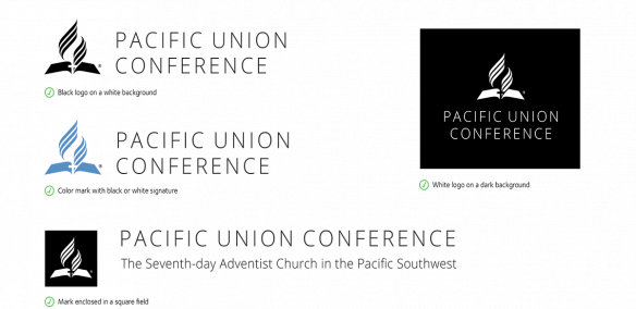
The logo can be used in various configurations. The mark can be displayed enclosed within a square field or without. The logo can be displayed with the tagline where appropriate or with- out. There are several acceptable vertical and horizontal arrangement as illustrated below. Graphic files of these locked configurations should always be used and are available from the Pacific Union Conference office.
Standard Horizontal Logo Configurations

- With Tagline:

- Without Tagline:
Standard Vertical Logo Configurations

- With Tagline:

- Without Tagline:
Standard Horizontal Logo Configurations - dark background

- With Tagline:

- Without Tagline:
Standard Vertical Logo Configurations - dark background

- With Tagline:

- Without Tagline:
When placing the logo on a page with other graphics, leave a generous amount of clear space surrounding it to avoid creating visual competition with other elements on the page. Clear space on all sides should be equal to the width of mark.
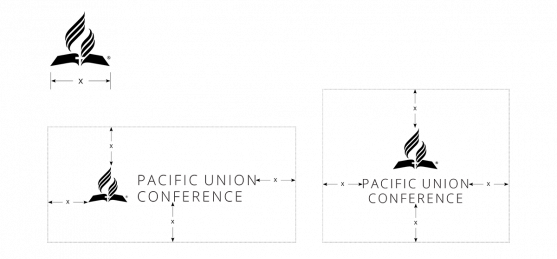
The logo should always be used in a consistent manner. Do not attempt to alter or embellish the logo in any way. Do not use unauthorized colors, change the style of the type, or alter the arrangement of the elements. The following pages provide guidelines for the proper and im- proper use of the logo.
Proper Use of the Logo
Improper Use of the Logo
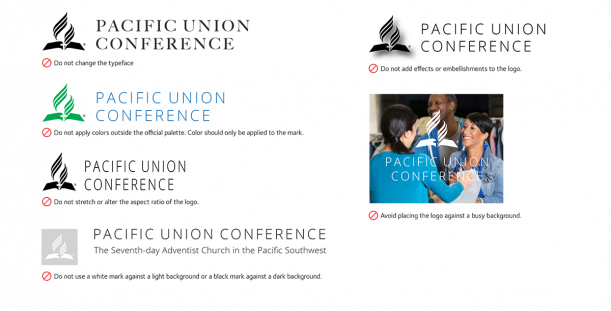
While black, white, or Alpine Blue are preferred, any color from the Pacific Union Conference color palette may be applied to the mark. The signature and tagline should always appear in black or, in some cases, white (if placed against a dark background). Do not use any colors other than those in the official palette. Below are example of proper application of color to the logo.
Proper Application of Color to the Logo
